Rob Casas and Roger Kline of Norwegian Cruise Line wrote this case study for my book, E-X-I-T-O: Su estrategia de marketing digital en 5 pasos (E-X-I-T-O: Your Digital Marketing Strategy in 5 Steps). Click here to read the first excerpt and second excerpt.
Background about Norwegian Cruise Line’s Business
Our online visitors fit a wide range of profiles: young, single, solo travelers or families interested in learning more about our family packages as well as couples planning their wedding anniversaries. A large segment of these visitors, however, tend to skew towards female “household planners” who take responsibility for planning and budgeting vacation time for their families.
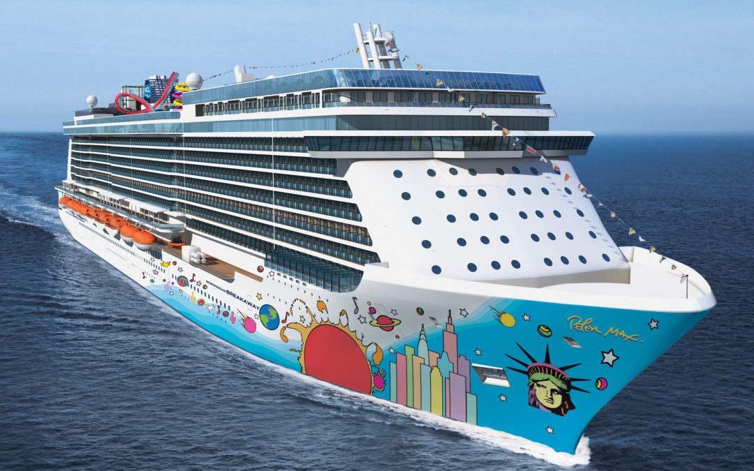
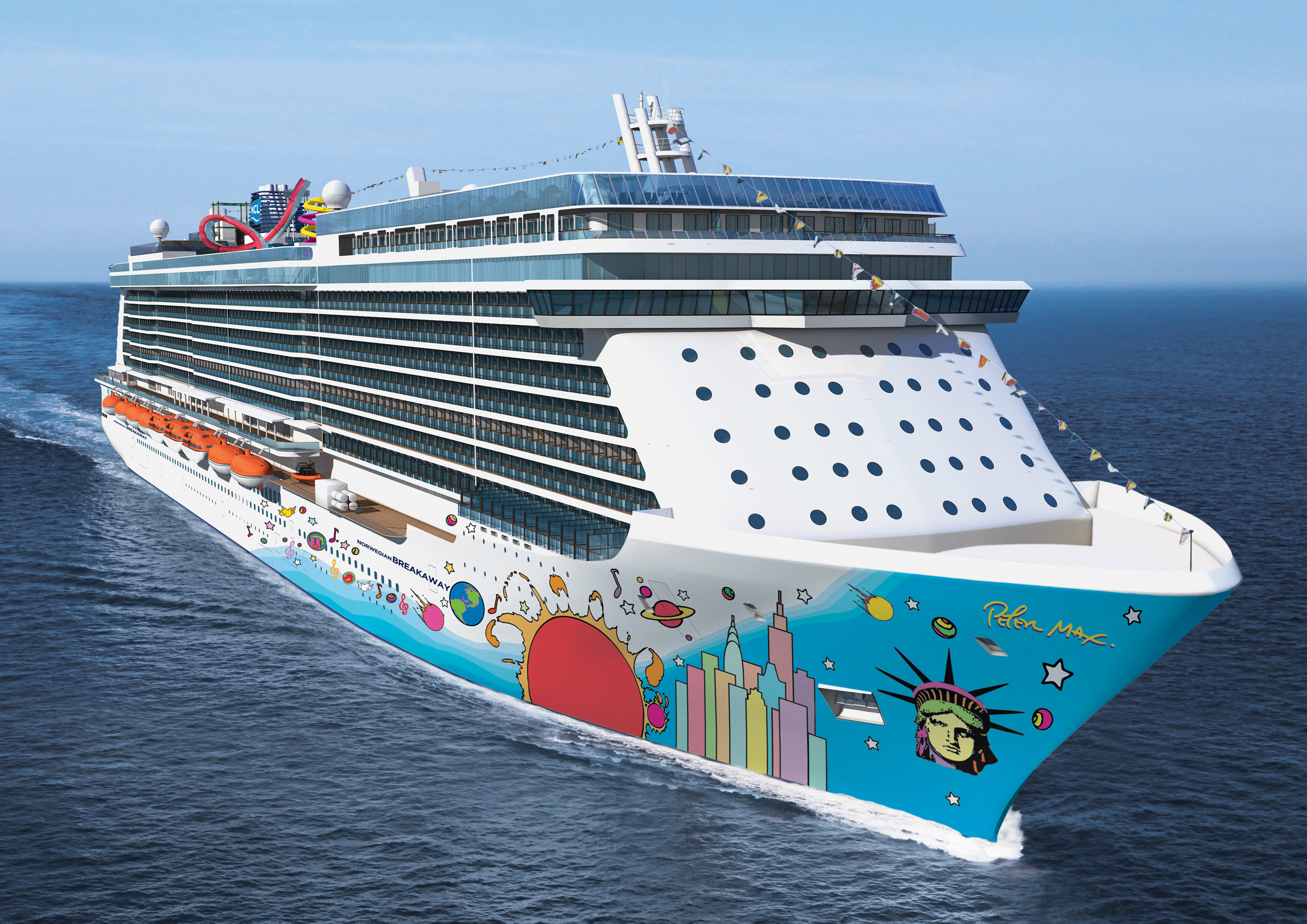
Norwegian Cruise Line markets to customers throughout the Americas, Europe and Asia. Our ships sail in the following regions:
- North America (US East/West/Gulf coasts, Alaska, Canada, Mexico East/West coasts)
- Latin America & Panama Canal
- Caribbean
- Bahamas
- Bermuda
- Europe (Baltic & Mediterranean)
We launched our Spanish-language website in July 2012. Our ships travel extensively throughout Latin America, including Cozumel, Costa Maya, Cabo San Luca, Acapulco, Mazatlan, Puerto Vallarta, Zihuatanejo/Ixtapa, Huatulco, Puerto Quetzal, Puntarenas, Belize City, Santo Tomas De Castilla, Roatan, Cartagena, Curacao, Semana, and San Juan. While the region constitutes only 2% of our business, it represents a great growth opportunity for us.
Our website, NCL.com, is supported in English as well as Spanish for our Latin American customers. We also have country-specific websites, that our international offices support, in Germany, Spain, Italy and the United Kingdom, each in their respective local language.
We connect with our customers through social media outlets such as Facebook, Google+, Twitter and Pinterest. Our Facebook fans interact with us on a daily basis. We receive many great ideas and suggestions through them. While visiting NCL.com, our visitors can tell us about their experiences on our cruises in “Customer Stories,” leave a review of their shore excursions, or “Ask & Answer” a question with the online community.
We also have a mobile-optimized site (m.ncl.com) for customers on the go, and have apps that allow them to customize their experiences onboard by enabling reservations for our restaurants, shore excursions, and spa facilities. Customers can also check their onboard account, locate their friends on the ship, or make ship-to-shore phone calls from the comfort of their smartphones. As we move forward, mobile will become even more critical as a way to connect with our customers.
Insights for Re-Design: Improving the Customer Experience
As most of us who work in marketing know, customer expectations evolve just as quickly as online technology does. In addition, the myriad number of choices available in selecting and planning for a cruise creates an inherent challenge in the cruise industry: how to provide an intuitive yet comprehensive experience that keeps online users engaged without asking them to pick up the phone and call someone, or worse yet, abandon our website altogether and visit a competitor’s website.
In 2010, we decided to redesign the look and feel of our website in order to improve the experience for our customers. Our site had ranked at the bottom of the anual Keynote Cruise Study in the design and organization category, so we knew we had to fix it. As a part of the redesign process, we prioritized website usability testing before beginning the development work.
Like other organizations with significant online operations, we have a variety of measurement tools that provide us with insights on how our customers interact with our website. Many are highly sophisticated business intelligence platforms. Both Roger and I have worked in online travel for many years. We have seen first-hand how costly mistakes can be when a website design lacks in-depth, qualitative feedback from your target customers.
The research we did mostly reinforced what we already suspected: no two customers are exactly alike, especially in the cruise industry. We realized that we had to plan for changes that would support a wide range of age groups and backgrounds. What feels intuitive to our internal design teams who work closely with our website is oftentimes perceived differently by our customers.
In our testing lab, we witnessed customers who had no trouble seeing a specific button or webite copy that others missed completely. Even if the majority of a group succeeds in completing a required task during a visit to a website, the few that fail in accomplishing it should provide marketers with a pause for consideration. When you improve your webite design to enable the few users who struggled, you will have greater success. Of course, you don’t want to degrade the experience for the majority of visitors who had no problem accomplishing a task either. So, it is important to design your website for a common denominator and utilize website best practices.
Revisions and Results After Usability Testing
Following our usability testing, we changed elements in the navigation, nomenclature, font sizes, color, button placements and styles, imagery. In addition, we made slight modifications to the functionality of the website. We revised anything where we had received substantial feedback, including our global menu bar and sub-menu content groupings.
The greatest reward was seeing a marked improvement in that year’s Keynote Cruise Study. We had ranked 6th out of 12 the prior year, and shot up to number 1. One of the most interesting things we learned was how much images influence the mood and brand perception of our customers online. For example, when we utilized a greater number of family images in the testing screens, usability participants tended to think of our product as family-centric. And if they came from family households, their results tended to yield a more positive experience.
Advice for Other Marketers
Plan for usability testing in your budget every year. Regular testing ensures that you won’t stray too far from the experience that your customers demand. And if you perform usability testing correctly, you have a much greater chance of delighting them.
Careful planning prior to usability testing is key. You want to ensure that you map out your objectives well in advance of your usability sessions so that your team can develop an effective testing plan that addresses consumers’ needs. This also allows time to develop robust testing assets, such as interactive models that can help drive richer, more accurate feedback.
This case study originally appeared on Portada in Spanish as “Marketing hacia LatAm – Norwegian Cruise Line, Rob Casas y Roger Kline.”

