While doing research about data visualization trends for my forthcoming book, Latino Link, I discovered a few eye-opening maps that display Internet and economic statistics in new and fun ways. In addition, when artists and illustrators envision the eighth continent, as Don DePalma calls the Internet in his book Business Without Borders, with a unique view of the virtual world, consumers respond, sharing these maps with friends via email, blogs, and social networks. Let’s take a look at a few examples here. Click on each map for a larger (easier-to-see) version.
This 2007 “Map of online communities” below, dominated by MySpace, the Gulf of YouTube, the Wikipedia project and the blogipelago, has been passed around so much that it is nearly impossible to trace its source.

The Japanese Web design firm Information Architects famously interprets the major players on the Internet via this virtual subway map, based on the Tokyo subway system. The station stop of each company reflects its status, as certain stops have a reputation for being upscale, or serving as a major hub, while others are known as down-and-out or out-of-the-way. For example, Google and Apple appear at the equivalent of Times Square in Tokyo, or at the center of the city. Information Architects’ clients and fans embraced this vision to such a degree that they spread IA’s map across the blogosphere; the agency now approaches a status of mythic proportions among design gurus.

(Since releasing four different versions of the above map, in May of 2010 they released this “Cosmic 140 Map” of the 140 most influential Twitter users.)
Much like Information Architects, the creative agency eBoy in Berlin designed this Web 2.0 neighborhood below, which features signs for Google, YouTube, Skype, Amazon, Last.fm, delicious, TechCrunch and Digg, among others.

Do you remember this Jesusland map that spread like wildfire via email just after the 2004 United States Presidential election? It captured the zeitgeist of the moment and the division between the red states, or “Jesusland,” and the blue states, or “The United States of Canada.” G. Webb created the original map on November 3, 2004, posting it on yakyak.org, an Internet message board. It was one of the first Internet “memes,” or cultural ideas passed along from one person to another. Today, a map like this one would spread across Facebook, Twitter, and the other social networks as well as email.

Speaking of social networks, if we compare the 2007 “Map of Online Communities” (the first map described above) with the “World Map of Social Networks” from 2009 below, we see that Facebook has clearly conquered MySpace in the Americas, Europe, Africa, India and Australia. An Italian blogger, Vincenzo Cosenza, designed the map, using IBM’s Many Eyes data visualization tool and put his URL at the top and center (www.vincos.it) of the map. If you want to promote your business with a map, post it on your blog, Facebook and Twitter, and include your URL at the top.

John Yunker, the web globalization guru of Byte Level Research, has already done this for his globalization and localization consultancy by developing a map of the more than 260 top-level domains (TLDs) used around the world. Yunker says, “Although .com is the world’s most popular TLD, it is far from alone. The Country Codes of the World map includes 245 country codes, which encompasses all United Nations countries as well as numerous islands and territories.” Each two-digit code in map appears over the country it represents. In addition to promoting the map on his website, Yunker sells a poster of his design just as Information Architects does with its map.


The two maps here of North/South America illustrate the Internet penetration by country as a percentage of the overall population in 2000 and then again in 2007. Notice how large the United States is in comparison to Latin America in the first one, and then, only six years later, Mexico and South America have grown much larger while the United States represents a proportionately smaller percentage of the Internet population across the Americas. Visit Worldmapper to see the original illustration.
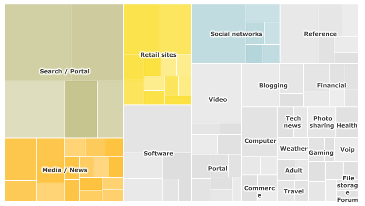
And this interactive graphic from the BBC (with data from Nielsen) shows the most popular content categories on the Internet. This “map” almost makes each category look like a ultra modern map of global continents. Check out the other visualizations on the BBC’s site here.

Defining the Future of Interactive Maps
Maps allow us to envision our world and define our markets for future growth. They tap into our imagination, inspire us and provide consumers with helpful, fun location-based information. Today, we need to rethink the way we draw maps for our customers and ourselves. GPS-powered, geo-targeted maps on mobile phones especially with hyper-niche or local content can open consumers’ eyes making their lives easier. Marketers can become heroes by developing helpful and contextually relevant product and location-based information on mobile maps.
How can you tap into the collective imagination of consumers so that they promote your vision of the world using social media platforms and email?